Exploring the NTSB Aviation Accident Database
The NTSB aviation accident database contains information from 1962 and later about civil aviation accidents and selected incidents within the United States, its territories and possessions, and in international waters. Notice that this data is not confined to commercial jet airplanes only. On Sept. 18, 2002, data from 1962-1982 were added to the aviation accident information. The format and type of data contained in the earlier briefs may differ from later reports. More information can be found here, while a data dictionary is available here.
We want to explore this data set to learn more about the improvement of aviation safety through the years. We download data from the NTSB website on the January 18th, 2020 as a TXT file. You can find the complete data set in our data folder too.
We notice that the file is a bit messed up. Some missing values are
labeled as NA, some others as N/A or empty. Values are separated by a
pipe | with leading and trailing spaces. Moreover, there is a pipe at
the end of each line which is definitely unconvenient. Hence, before
importing into R, we decide to clean the data in Python. You can find
the code we used in the analysis
folder.
As a result, we run the following analysis on the cleaned data set
available in the data folder.
Importing data
First off, we load the packages and import the file into a dataframe. If
you are missing any packages, you can install them with
install.packages().
We also want to be sure that no leading or trailing whitespaces are left
in the data set. Let’s use strip.white to do so when reading the CSV
file.
library(data.table)
library(tidyverse)
library(dplyr)
library(stringr)
library(mapproj)
library(maps)
library(lubridate)

df <- read.delim("../data/raw/AviationDataCleaned.csv", sep ="\t", header = TRUE, fill = TRUE, dec =".", strip.white=TRUE)
So, this is how our data set appears straight away:
| Event.Id | Investigation.Type | Accident.Number | Event.Date | Location | Country | Latitude | Longitude | Airport.Code | Airport.Name | Injury.Severity | Aircraft.Damage | Aircraft.Category | Registration.Number | Make | Model | Amateur.Built | Number.of.Engines | Engine.Type | FAR.Description | Schedule | Purpose.of.Flight | Air.Carrier | Total.Fatal.Injuries | Total.Serious.Injuries | Total.Minor.Injuries | Total.Uninjured | Weather.Condition | Broad.Phase.of.Flight | Report.Status | Publication.Date |
|---|---|---|---|---|---|---|---|---|---|---|---|---|---|---|---|---|---|---|---|---|---|---|---|---|---|---|---|---|---|---|
| 20200108X05551 | Accident | ANC20CA012 | 01/07/2020 | Kapolei, HI | United States | 21.30389 | -158.07417 | JRF | Kalaeloa (John Rodgers Field) | Non-Fatal | Substantial | Airplane | N779LB | Cirrus | SR22 | No | NA | Part 91: General Aviation | Personal | NA | NA | 2 | NA | Preliminary | 01/08/2020 | |||||
| 20200107X14009 | Accident | WPR20CA059 | 01/04/2020 | Mokelumne Hills, CA | United States | 38.29556 | -120.72083 | PVT | Unavailable | Substantial | Helicopter | N92785 | Sud Aviation | SE 3130 ALOUETTE II | No | NA | Part 91: General Aviation | Personal | NA | NA | NA | NA | Preliminary | 01/07/2020 | ||||||
| 20200104X82940 | Accident | CEN20LA055 | 01/04/2020 | Mullin, TX | United States | 31.65028 | -98.65417 | Private Airstrip | Non-Fatal | Substantial | Airplane | N5573M | Aero Commander | 100 | No | 1 | Reciprocating | Part 91: General Aviation | Instructional | NA | NA | NA | 2 | VMC | APPROACH | Preliminary | 01/13/2020 | |||
| 20200102X82407 | Accident | WPR20CA055 | 12/31/2019 | Elk, CA | United States | 39.12861 | -123.71583 | LLR | Little River | Non-Fatal | Substantial | Airplane | N7095M | Cessna | 175 | No | 1 | Reciprocating | Part 91: General Aviation | Personal | NA | NA | NA | 1 | VMC | TAKEOFF | Factual | 01/13/2020 | ||
| 20191231X83852 | Accident | CEN20FA049 | 12/31/2019 | OLATHE, KS | United States | 38.84611 | -94.73611 | OJC | Johnson County Executive | Fatal(2) | Destroyed | Airplane | N602TF | Mooney | M20S | No | 1 | Reciprocating | Part 91: General Aviation | Personal | 2 | NA | NA | NA | VMC | TAKEOFF | Preliminary | 01/08/2020 | ||
| 20200102X54844 | Accident | ANC20CA011 | 12/31/2019 | Fairbanks, AK | United States | 64.66694 | -148.13333 | N/A | Non-Fatal | Substantial | Airplane | N4667C | Cessna | 170 | No | 1 | Part 91: General Aviation | Personal | NA | NA | NA | 2 | Preliminary | 01/02/2020 |
Let’s prepare the dataframe for further analysis. We fix the missing value issue only for the columns we intend to use later and we update empty cells consistently with the way unknown values are treated in their respective columns.
We also create a new dummy variable, coded Fatal when
Injury.Severity is different from Non-Fatal, Unavailable or
Incident. All “accidents” in the online aviation accident database are
classified as either “Non-Fatal” or “Fatal”, while there is no injury
severity classification for “incidents”.
From NTSB definitions:
An accident is defined as “an occurrence associated with the operation of an aircraft which takes place between the time any person boards the aircraft with the intention of flight and all such persons have disembarked, and in which any person suffers death or serious injury, or in which the aircraft receives substantial damage”. An incident is defined as “an occurrence other than an accident, associated with the operation of an aircraft, which affects or could affect the safety of operations.”
# Transform from factor to date class
df$Event.Date <- as.Date(df$Event.Date, format = "%m/%d/%Y")

# Update empty cells
df$Broad.Phase.of.Flight[df$Broad.Phase.of.Flight == ""] <- "UNKNOWN"
df$Weather.Condition[df$Weather.Condition == ""] <- "UNK"
df$Aircraft.Damage[df$Aircraft.Damage == ""] <- NA

# Add dummy for fatalities in accident
df <- mutate(df, IsFatal = ifelse(!Injury.Severity %in% c("Non-Fatal", "Unavailable", "Incident"), "Fatal", "Not Fatal"))
Let’s now create a new dataframe to retrieve only fatal accidents that involve an airplane. An accident is fatal if any injury results in the death of at least one person within 30 days of the accident.
df_fatal <- df %>%
  filter(Aircraft.Category == "Airplane" & IsFatal == "Fatal")
Exploration
Where?
Let’s now explore our data set. First of all, we can plot a map of all
accidents. Since 2002, NTSB records of accidents and incidents occurring
in the United States include Latitude and Longitude information.
However, in some cases the latitude/longitude coordinates are estimated
from the nearest town or airport rather than the precise location of the
accident or incident site. We find many observations with missing
latitude and longitude information, so we obviously exclude them.
First, we plot a world map. Then, we add information about the location, aircraft damage and total number of fatal injuries of the accidents.
world_data <- map_data("world")
world_map <- ggplot() +
  geom_polygon(data = world_data, aes(x = long, y = lat, group = group)) +
  coord_fixed(1.3) +
  theme_void()

col <- c("Minor" = "#FFCCA8", "Substantial" = "#F08986", "Destroyed" = "#DC1C13", "Unknown" = "#D4D4D4")
plot1 <- world_map +
  geom_point(data = df_fatal, aes(Longitude, Latitude, color=Aircraft.Damage, size=Total.Fatal.Injuries)) +
  scale_color_manual(values = col, breaks = c("Minor", "Substantial", "Destroyed", "Unknown")) +
  labs(title = "Location of Accidents, Aircraft Damage and Number of Fatal Injuries", color = "Aircraft Damage", size = "Total Fatal Injuries") +
  theme_void() +
  theme(plot.title = element_text(vjust=2))
plot1
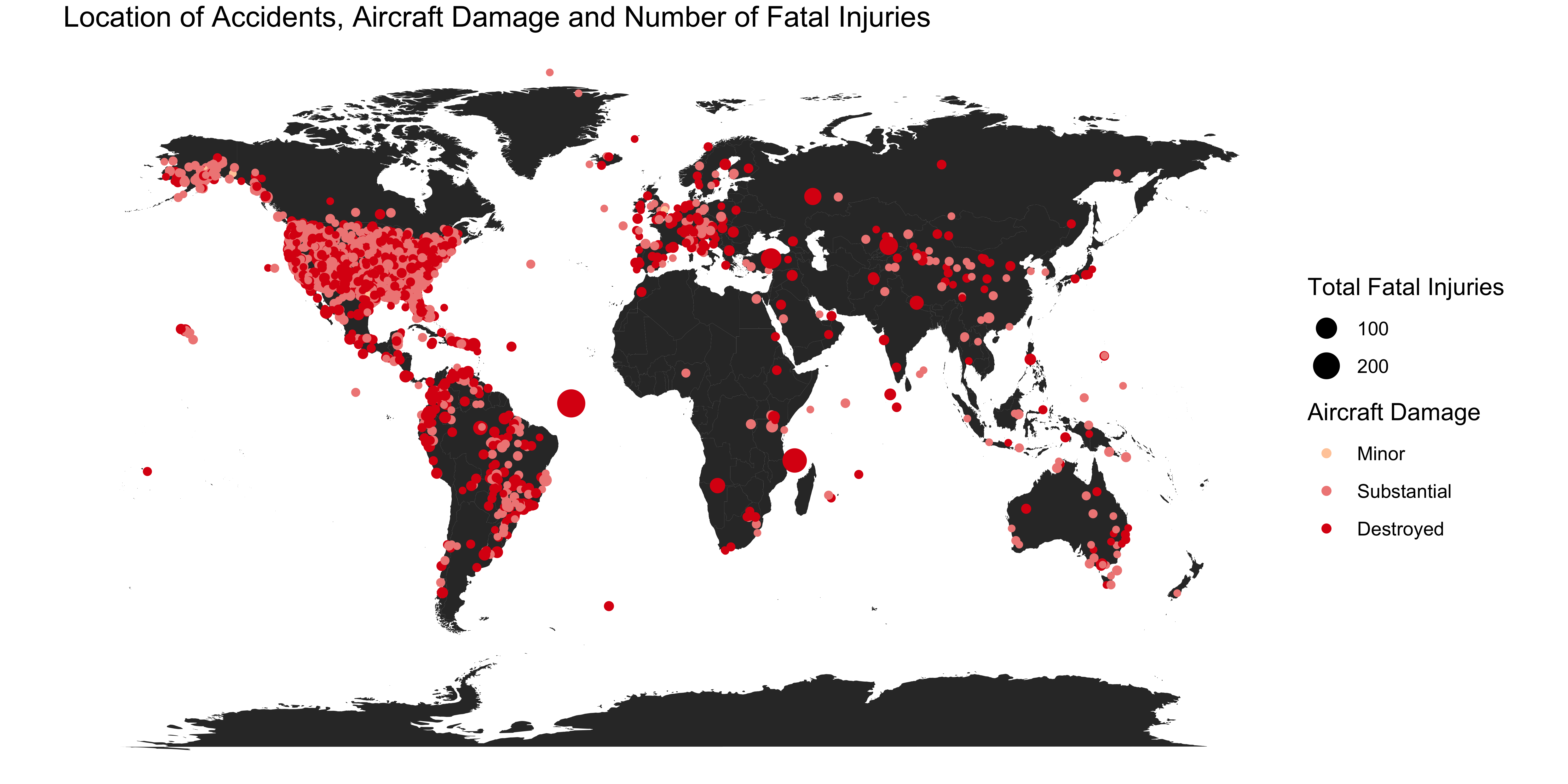
Please notice that the high concentration of accidents in the United States is due to the fact that the NTSB mainly deals with accidents within the US, in international waters, or with US aircrafts.
When?
We wonder whether the number of accidents has decreased over time. In other words, is flying safer today? First, we need to group the accidents by date.
accidents_date <- df %>%
  mutate(Date = format(Event.Date, "%Y-%m")) %>%
  group_by(Date) %>%
  summarize(total = n())
accidents_date$Date <- as.Date(paste(accidents_date$Date, "-01", sep = ""), format = "%Y-%m-%d") # Transform Date as class date again, adding a fake day
We can now plot a first time series.
plot2 <- ggplot(accidents_date, aes(Date, total, group=1)) +
  geom_line() +
  # scale_x_discrete(breaks = unique(accidents_date$Date)[seq(1, 500, 12)]) + # Show one label per year, only works if Date is not class date (a character)
  scale_x_date(date_breaks = "years" , date_labels = "%Y") +
  coord_cartesian(xlim = as.Date(c("1983-01-01", "2018-06-01"))) +
  labs(title = "Number of Total Accidents per Year", x = "Accident Date", y = "Number of Accidents") +
  theme_bw() +
  theme(axis.text.x = element_text(angle = 45, hjust = 1, margin = margin(b = 20)),
        axis.text.y = element_text(margin = margin(l = 20)),
        plot.title = element_text(vjust=2))
plot2

We observe an overall negative trend in the number of accidents over the years. Also, we see that flight seasonality plays an important role in this context. More people are willing to fly during the summer, thus more flights are scheduled (e.g., see these facts from the Bureau of Transportation Statistics). We speculate that this could explain the yearly spikes in the months of June and July.
But what about the number of fatalities per year? Let’s compute that and group by date again.
fatal_injuries_date <- df_fatal %>%
  mutate(Date = format(Event.Date, "%Y")) %>%
  group_by(Date) %>%
  summarize(total = sum(Total.Fatal.Injuries))
fatal_injuries_date$Date <- as.Date(paste(fatal_injuries_date$Date, "-01-01", sep = ""), format = "%Y-%m-%d") # Transform Date as class date again, adding a fake day
We can now plot the time series from this new dataframe.
plot4 <-  ggplot(fatal_injuries_date, aes(Date, total, group=1)) +
  geom_line() +
  scale_x_date(date_breaks = "years" , date_labels = "%Y") +
  coord_cartesian(xlim = as.Date(c("1983-01-01", "2018-06-01"))) +
  labs(title = "Number of Fatal Injuries per Year", x = "Accident Date", y = "Number of Fatal Injuries") +
  theme_bw() +
  theme(axis.text.x = element_text(angle = 45, hjust = 1, margin = margin(t = 5, b = 20)),
        axis.text.y = element_text(margin = margin(r = 5, l = 20)),
        plot.title = element_text(vjust=2))
plot4
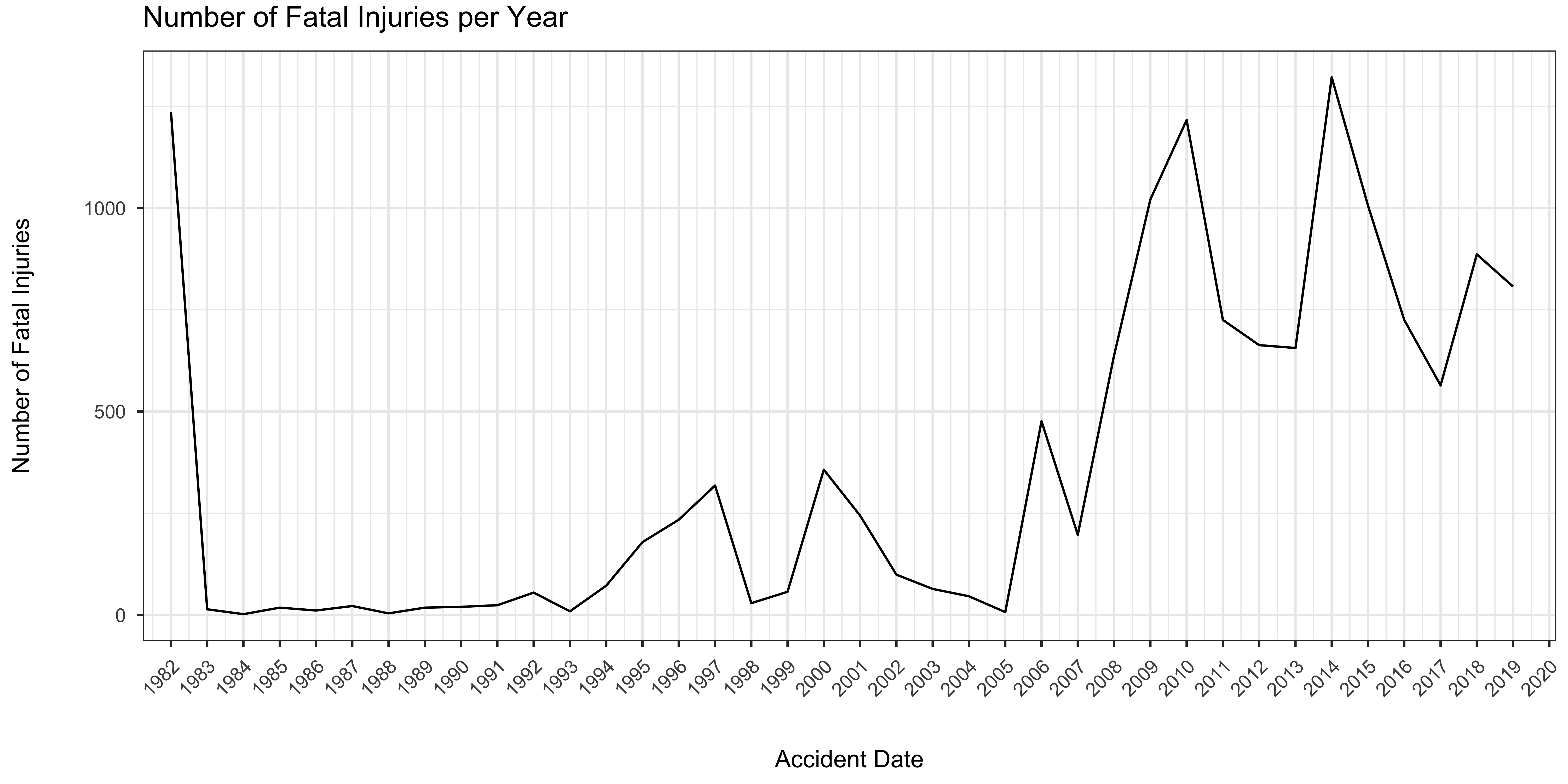
From this plot, it might seem like flying today is riskier than in the past. However, this is a completely wrong conclusion. Instead, this plot should should be integrated with information about the number of flights per year (that, unfortunately, we are missing in our data set). That is to say that more people are flying nowadays than in the past. Moreover, today’s aircrafts are much larger than in the past and therefore we suspect a higher number of fatalities per fatal accident. On the other hand, flying today has never been safer and the number of fatal accidents is steadily decreasing (as shown in the previous plot).
Wondering why there is no spike on 9/11? Injuries to persons not aboard the airplane are not included in the data set.
Is it safer to take off or land?
We wonder what’s the most dangerous phase of a flight. In the table below, we show the distinct phases ordered by the number of fatal accidents.
# Fatal accidents per flight phase
df_fatal %>% count(Broad.Phase.of.Flight, sort=TRUE)
## # A tibble: 12 x 2
##    Broad.Phase.of.Flight     n
##    <fct>                 <int>
##  1 UNKNOWN                1253
##  2 MANEUVERING             866
##  3 TAKEOFF                 815
##  4 APPROACH                535
##  5 CRUISE                  460
##  6 DESCENT                 148
##  7 CLIMB                   122
##  8 GO-AROUND               109
##  9 LANDING                  98
## 10 STANDING                 32
## 11 OTHER                    20
## 12 TAXI                      5
However, maybe it’s more interesting to plot these phases and check the occurrence of accidents difference between fatal and not-fatal ones.
plot5 <- ggplot(df, aes(IsFatal, fill = IsFatal)) +
  geom_bar() +
  facet_wrap(~ Broad.Phase.of.Flight, scales = "free") +
  labs(title = "Number of Fatal and Not Fatal Accidents per Flight Phase", x = "Is the Accident Fatal?", y = "Number of Accidents", fill = "Is the Accident Fatal?") +
  theme_bw() +
  theme(axis.text.x = element_text(margin = margin(t = 5, b = 20)),
        axis.text.y = element_text(margin = margin(r = 5, l = 20)),
        plot.title = element_text(vjust=2))
plot5
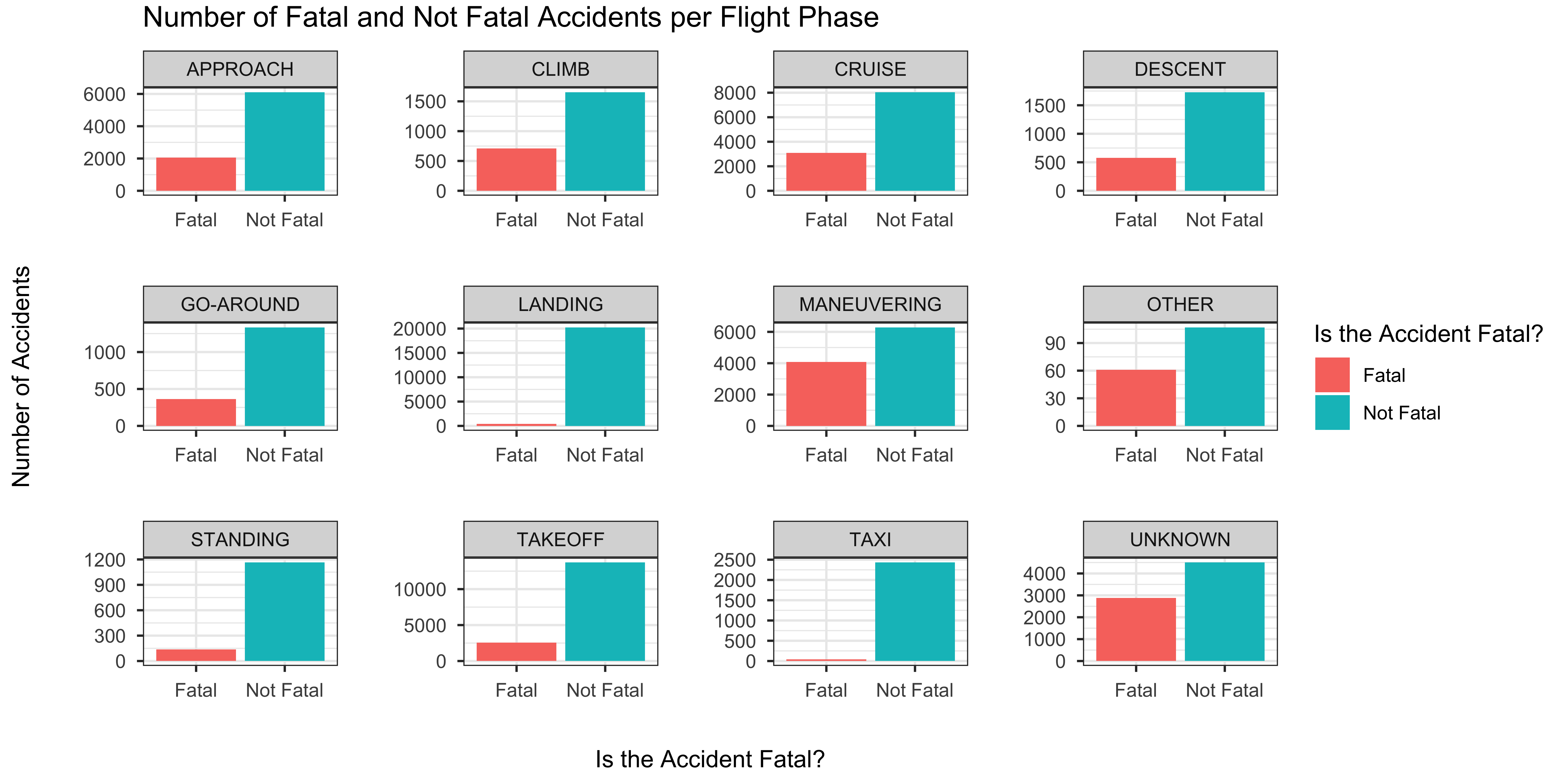
Actually, it looks like the most fatal accidents occured when maneuvering - i.e., turning, climbing, or descending close to the ground. This is consistent with what the FAA declares.
Storms ahead?
We suspect that most of the fatal accidents occured in bad weather. Let’s check this.
# We see that when IMC --> fatal > non fatal
plot6 <- ggplot(subset(df, !Weather.Condition == "UNK"), aes(Weather.Condition, fill = IsFatal)) + # Ignore UNK weather conditions
  geom_bar(position = "dodge2") +
  facet_wrap(~ Broad.Phase.of.Flight, scales = "free") +
  labs(title = "Number of Accidents per Weather Condition, Fatality and Flight Phase", x = "Weather Condition", y = "Number of Accidents", fill = "Is the Accident Fatal?") +
  theme_bw() +
  theme(axis.text.x = element_text(margin = margin(t = 5, b = 20)),
        axis.text.y = element_text(margin = margin(r = 5, l = 20)),
        plot.title = element_text(vjust=2))
plot6
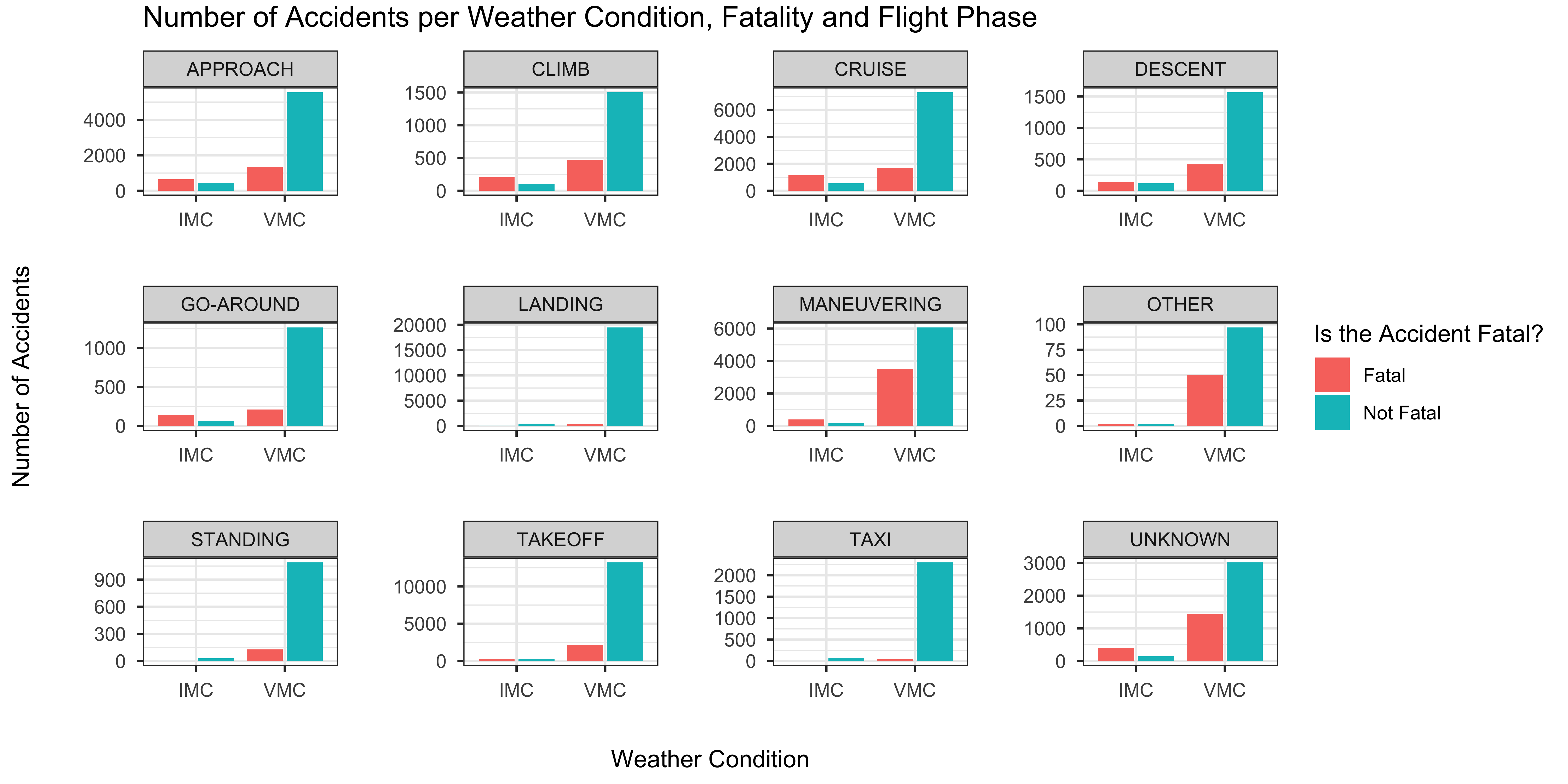
As predicted, the majority of accidents in Visual Meteorological Condition (VMC, which generally means good weather) are not fatal. On the contrary, most of the accidents in Instrument Meteorological Conditions (IMC, i.e., bad weather) are fatal.
Airbus v. Boeing
Is Airbus really safer than Boeing? Let’s compute the number of accidents for these two players.
accidents_manufacturer <- subset(df, Event.Date > as.Date("2000-01-01")) %>%
  mutate(Manufacturer = ifelse(Make %in% c("BOEING", "Boeing"), "Boeing", ifelse(Make %in% c("AIRBUS", "Airbus"), "Airbus", "Other"))) %>%
  group_by(Manufacturer, IsFatal) %>%
  summarize(total = n())
We can now plot this, controlling for fatalities and subsetting accidents from 01/01/2000 or more recent.
plot7 <- ggplot(subset(accidents_manufacturer, !Manufacturer == "Other"), aes(Manufacturer, total, fill = IsFatal)) + # Only keep Airbus and Boeing
  geom_col(position = "dodge2") +
  labs(title = "Number of Accidents per Manufacturer from January 2000", x = "Manufacturer", y = "Number of Accidents", fill = "Is the Accident Fatal?") +
  theme_bw() +
  theme(axis.text.x = element_text(margin = margin(t = 5, b = 20)),
        axis.text.y = element_text(margin = margin(r = 5, l = 20)),
        plot.title = element_text(vjust=2))
plot7
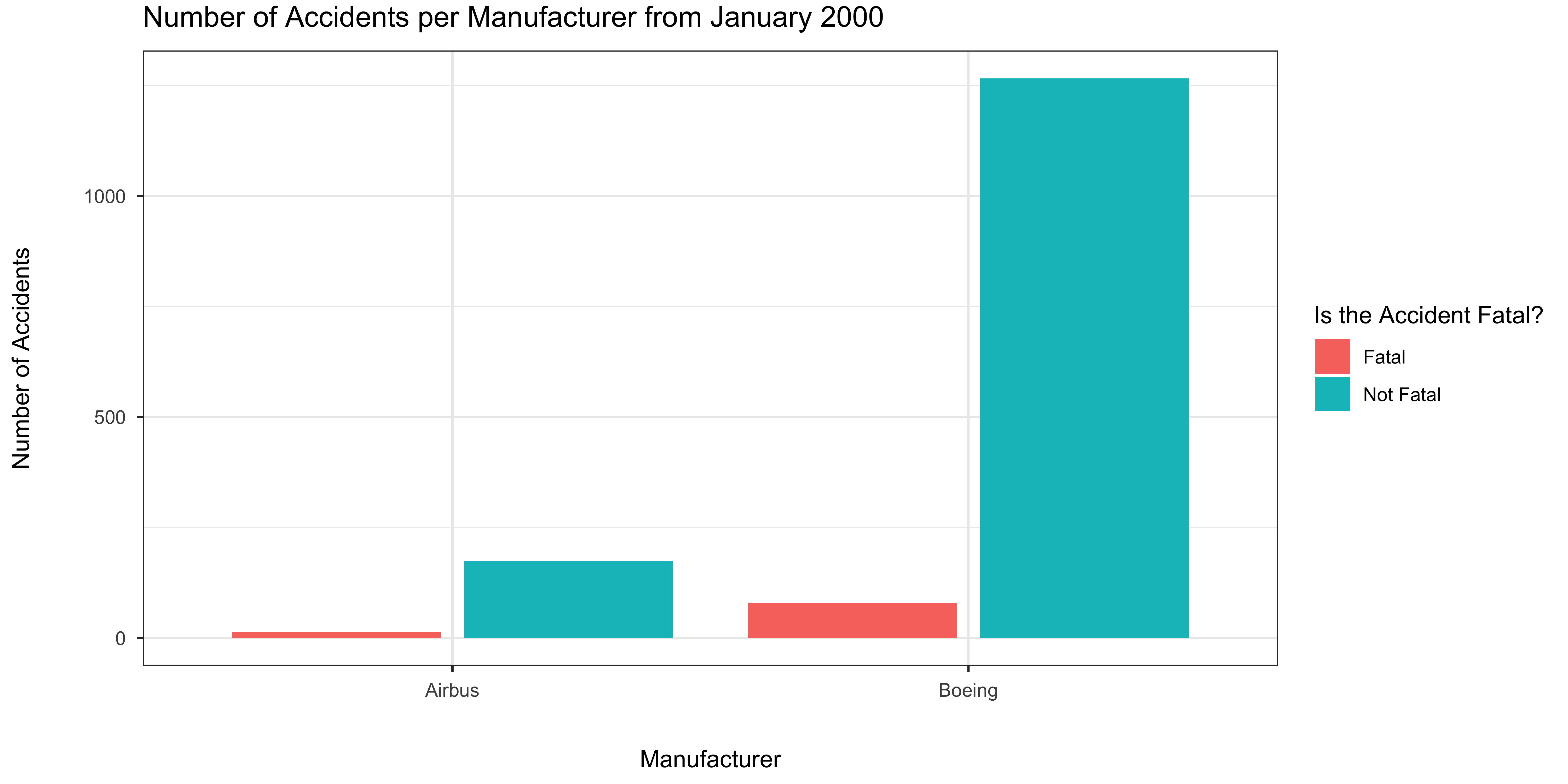
Please notice that this is not a really fair comparison. For instance, a higher number of accidents for Boeing could be attributed to the fact that it is more popular than Airbus in the United States. More research is definitely needed.
What about airports?
Finally, here’s a list of airports (IATA codes) ordered by the number of accidents that took place within 3 miles from them, or the involved aircraft was taking off from, or on approach to, them.
# Most dangerous airports
subset(df, !Airport.Code %in% c("", "NONE", "None", "PVT", "N/A")) %>% count(as.character(Airport.Code), sort=TRUE)
## # A tibble: 10,021 x 2
##    `as.character(Airport.Code)`     n
##    <chr>                        <int>
##  1 APA                            152
##  2 ORD                            150
##  3 MRI                            131
##  4 DEN                            113
##  5 OSH                            100
##  6 BJC                             97
##  7 VNY                             97
##  8 FFZ                             92
##  9 DVT                             90
## 10 PRC                             87
## # … with 10,011 more rows
Centennial Airport is the first on the list, which might seem odd. However, it is located only 15 nautical miles from Denver International Airport (DEN), the fourth airport on the list and much busier one. Chicago O’Hare International Airport and Merrill Field (Alaska) follow at the second and third place.
Want more?
You can find more information like this in the Statistical Summary of Commercial Jet Airplane Accidents from Boeing, which includes accidents from 1959 to 2017.
Contributing
Feel free to reproduce this study or emulate this setup for your own project. Pull requests are welcome!
License
All materials are licensed under a Creative Commons CC-BY-SA-4.0 license.